alternate_email
Get in touch
close
alternate_email
dark_mode
light_mode
Switch to dark mode
Switch to light mode
Robert Half
Winter 2021

Intranet Design System

Overhauling Robert Half's Intranet Design System
Overview

Architecting & Engineering a Redesign

Organization
Robert Half
My Role
Lead UX Designer and Front-end Developer – UX Design, UI Design, Interaction Design, Visual Design, Information Architecture, HTML, CSS, Javascript
Timeline and Status
4 Months – Launched Winter 2021
The Goal
Redesign and code the Robert Half Intranet Design System for both desktop and mobile, enhancing its usability and scalability while focusing on Information Architecture, taxonomy, and a complete UI overhaul.
The Problem

A Maze, Not a Map

A challenge to access information

The existing intranet design system exhibited inconsistencies in layout standards, less intuitive navigation, and required UI upgrades, making it challenging for users to access key information.

sentiment_dissatisfied
Design Inconsistencies
Lacking standardization and navigation issues.
sentiment_dissatisfied
Hindered Information Access
Difficulty accessing information in a timely manner.
sentiment_dissatisfied
Legacy UI
Older interface elements needing a refresh.
sentiment_satisfied
The Solution
Transform the intranet design system into a uniform, user-friendly, and efficient tool, benefiting both newcomers and veterans.
Project Timeline
experiment
User Research & Needs Analysis
Gather feedback on user pain points and business goals.
account_tree
Information Architecture
Rework Information Architecture, taxonomy, & flows.
stylus_note
Low-Fidelity Prototyping
Prototyping for user feedback.
web
High-Fidelity Design
Refine designs, define color, styles, components.
code_blocks
Front-End Development
Build with HTML, CSS, & Javascript.
Weeks 1-4
Weeks 5-8
Weeks 9-12
Weeks 13-16
User Research & Needs Analysis
Gather feedback on user pain points and business goals.
Information Architecture
Rework Information Architecture, taxonomy, & flows.
Low-Fidelity Prototyping
Prototyping for user feedback.
High-Fidelity Design
Refine designs, define color, styles, components.
Front-End Development
Build with HTML, CSS, & Javascript.
2.0
Project Timeline & Tasks
Diagram
Audience

The Intranet Builders

Seeking clarity, accessibility, & support

Designers, developers, and project managers were the focus of the redesign. These stakeholders struggled with the existing system's inefficiencies, desiring a more streamlined, standardized guide for creating and updating intranet pages.

directions
Require clear direction and clarity through well-defined specifications, guidelines, and usage instructions.
acute
Should be able to swiftly access the necessary resources with ease.
contact_support
Need to easily identify who to contact for assistance or inquiries if something is not found.
format_quote

Straight from the source

"Navigating through our design resources is like a maze, and it slows down our workflow significantly."
Developer
"We waste so much time reinventing the wheel when it comes to design elements. A cohesive design system would be a game-changer."
Designer
"Our design process lacks consistency, and it's affecting the quality of our pages. We need a design system to bring order to the chaos."
Director
"Consistency is a constant battle. With standardized guidelines, our workflow would be much smoother."
Developer
"Our design files are all over the place. It's like a digital scavenger hunt every day."
Designer
Process

A Data-Driven Approach

Diagnosing Issues

Upon receiving the executive mandate, the first thing I did was collaborate with the research team to perform a comprehensive UX audit. We scoured through user interviews and analytics to identify pain points in the existing design system.

It became clear that users were frustrated with the site's confusing layout and lack of guidance. Their problems ranged from informational architecture to UI complexities, leading to site drop-offs.

We decided to use the number of site visits to the design system as our key performance indicator. This would help us measure the success of our redesign.

Problems & Solutions
warning
Inefficient Information Discovery
check_circle
Redesign Information Architecture
warning
Inconsistent Design Elements
check_circle
Standardize Guidelines & Components
warning
Outdated UI Elements
check_circle
UI Overhaul
warning
Lack of Clarity on Usage
check_circle
Emphasize primary actions & usage
warning
Inconsistent Visual Hierarchy
check_circle
Improved Visual Hierarchy
warning
Complexity in Scaling
check_circle
Scalability

Laying the Groundwork

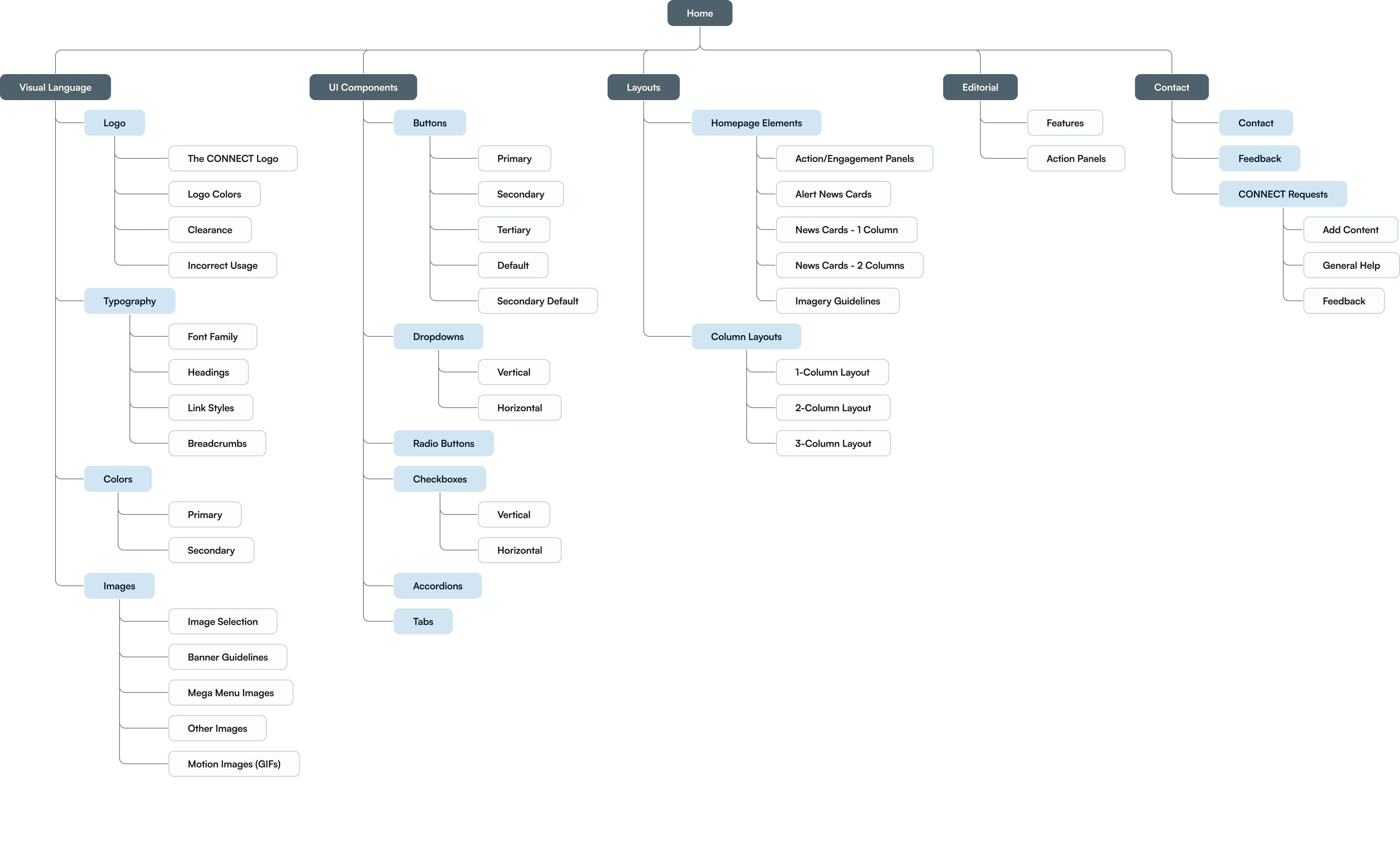
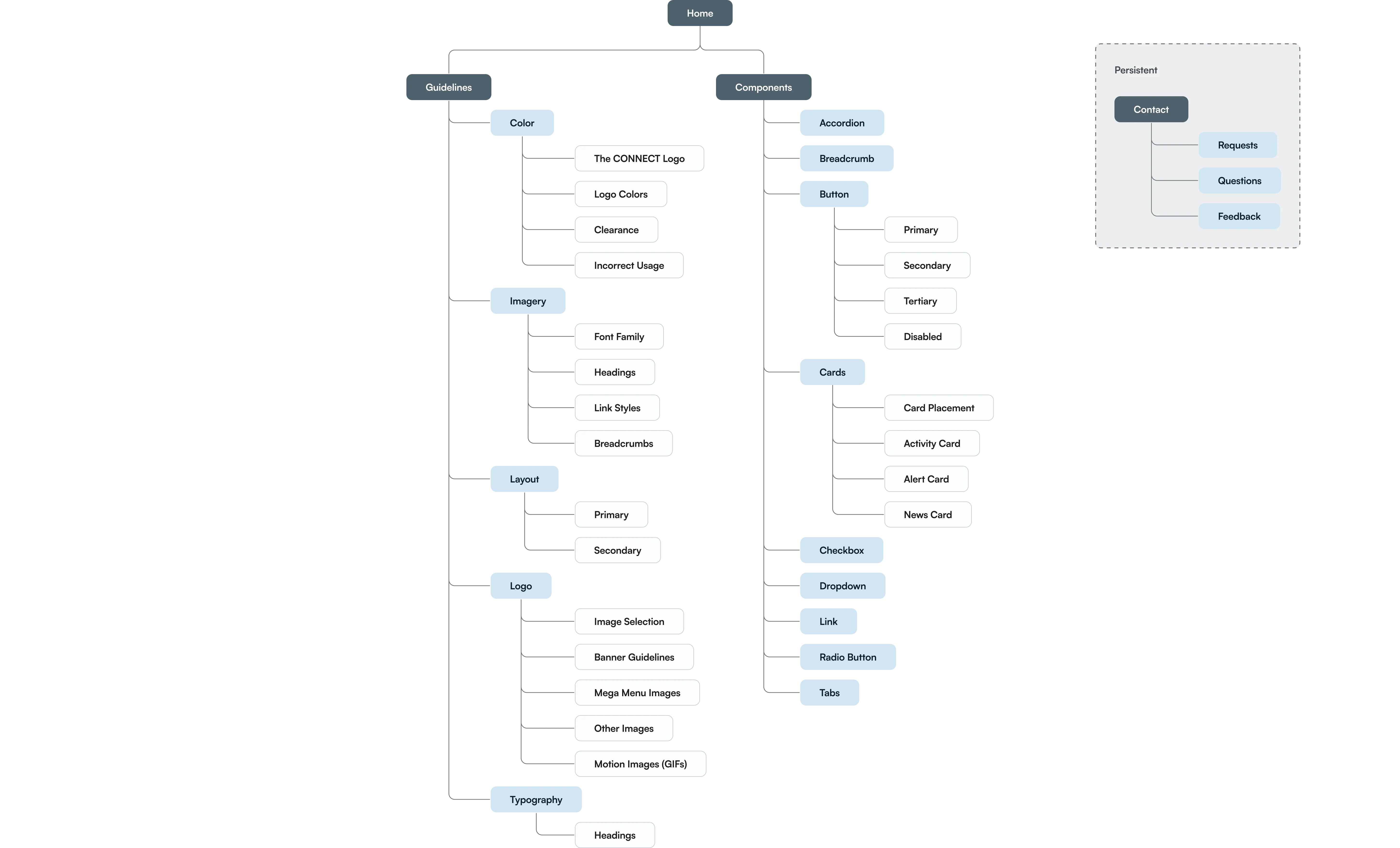
After gaining insights, I created a new sitemap to streamline the informational architecture. I also overhauled the taxonomy to simplify site navigation. These changes received executive approval before moving on to the design phase.

View Static Images
Before
Information Architecture (Before & After)
After
Information Architecture (Before & After)
sync_alt
4.0
Information Architecture (Before & After)
Interactive
Information Architecture (Before)
4.0.A
Information Architecture (Before)
Image
arrow_downward
arrow_right_alt
Information Architecture (After)
4.0.B
Information Architecture (After)
Image

Critical Areas

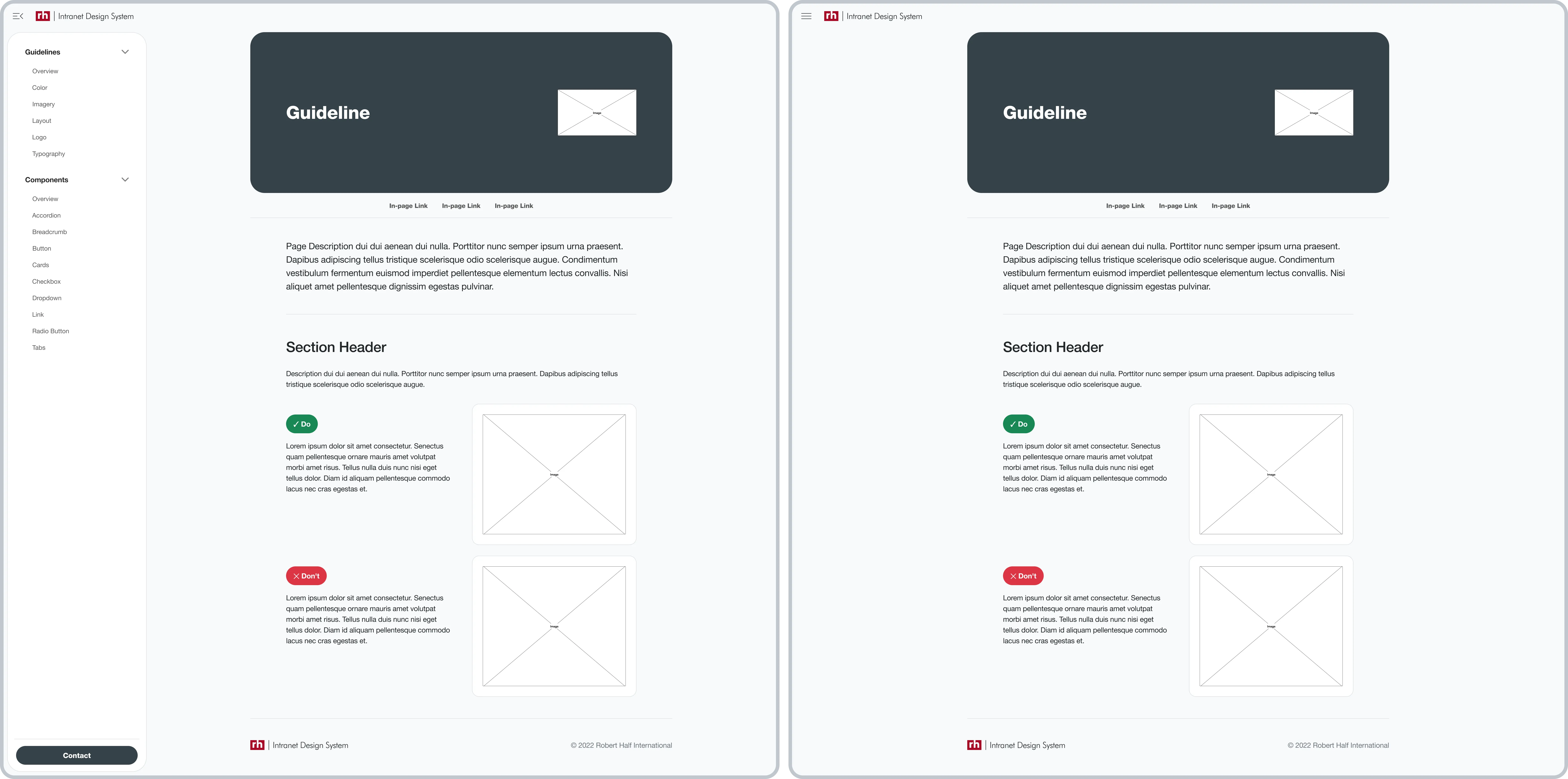
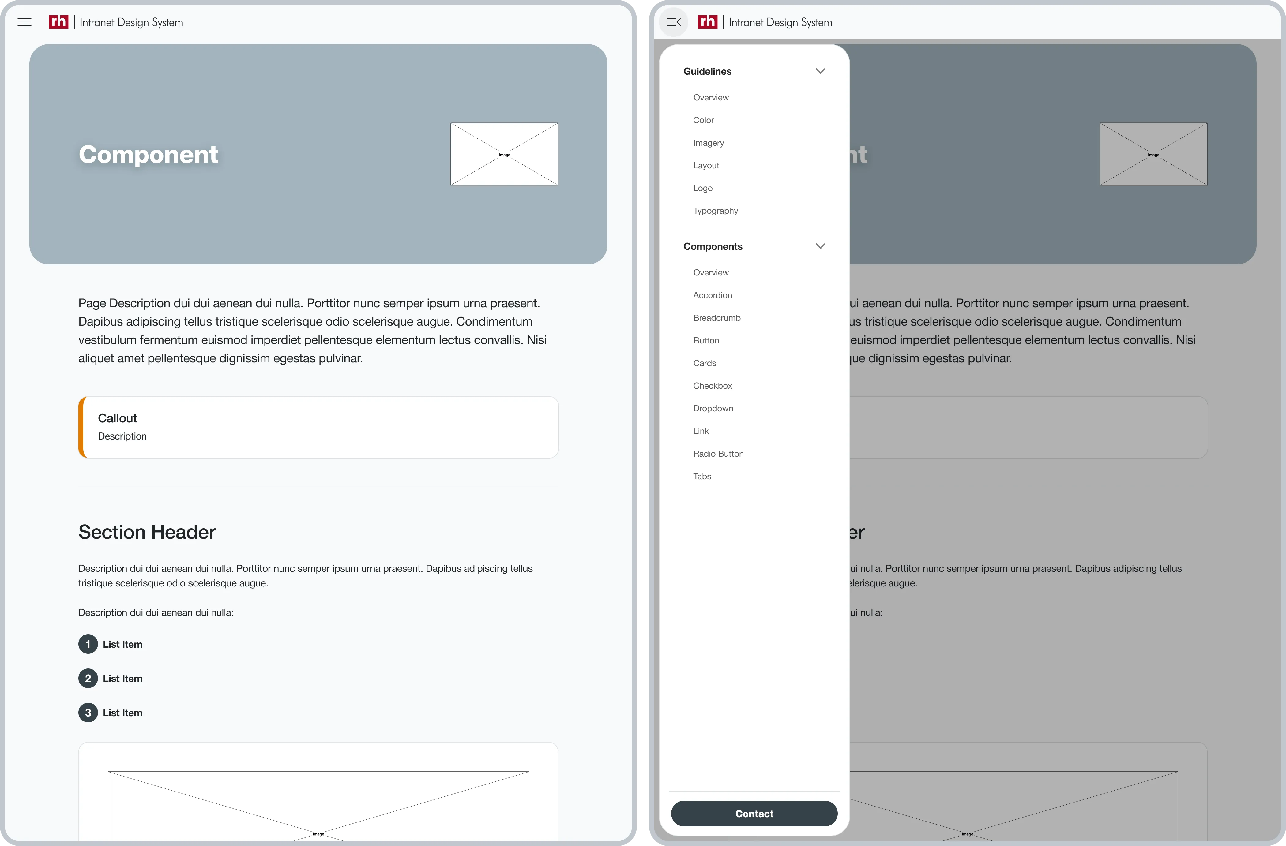
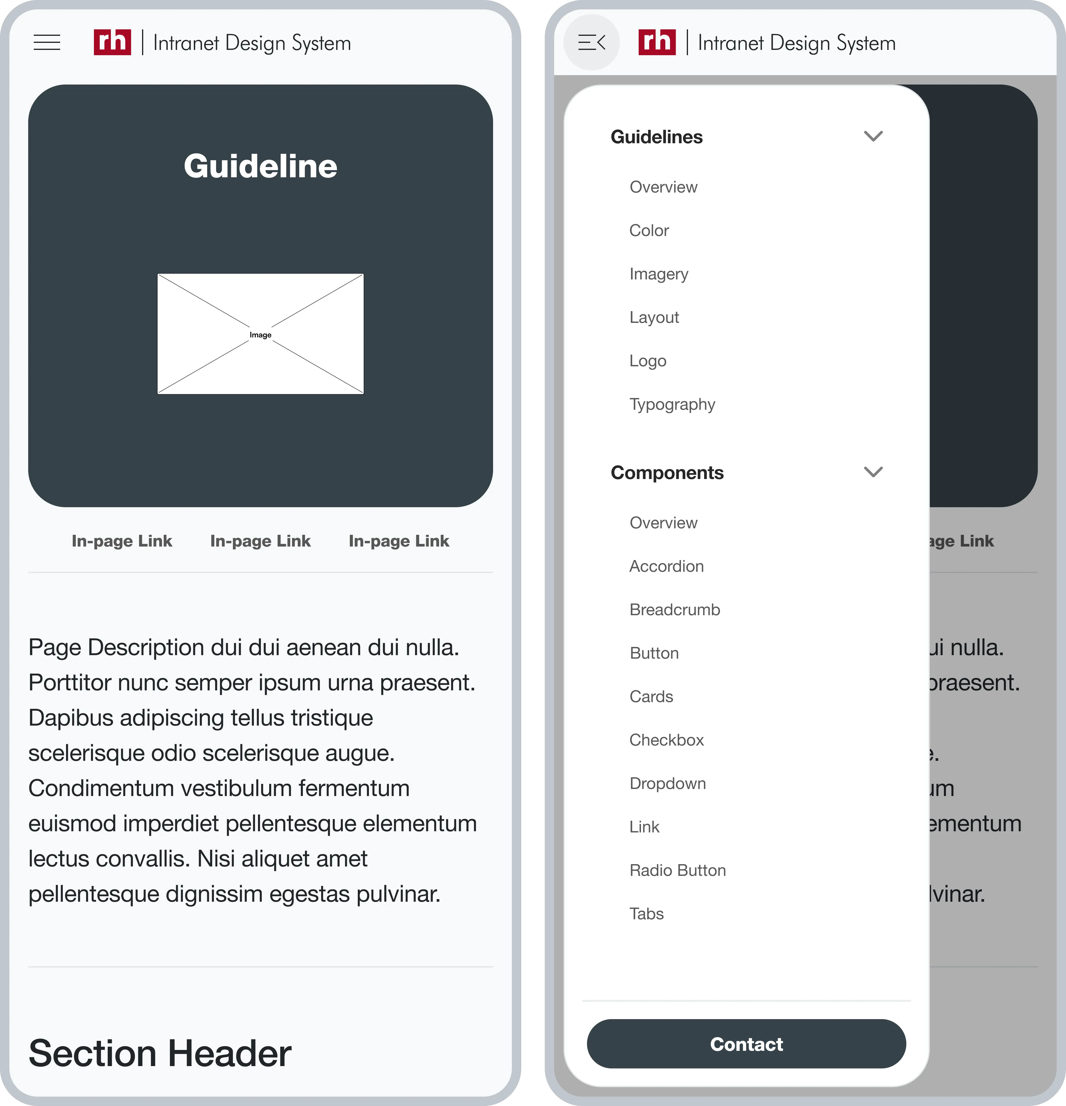
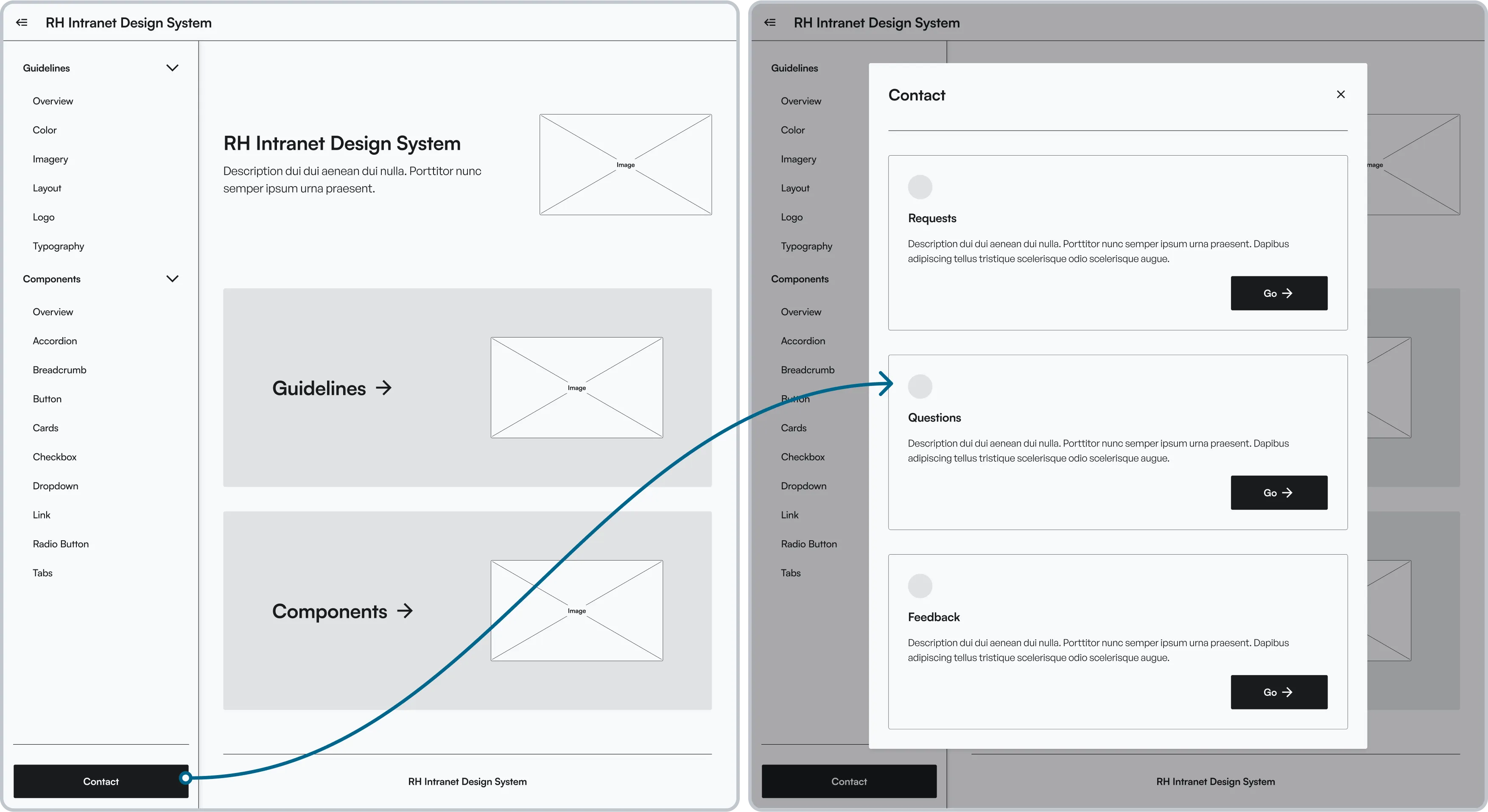
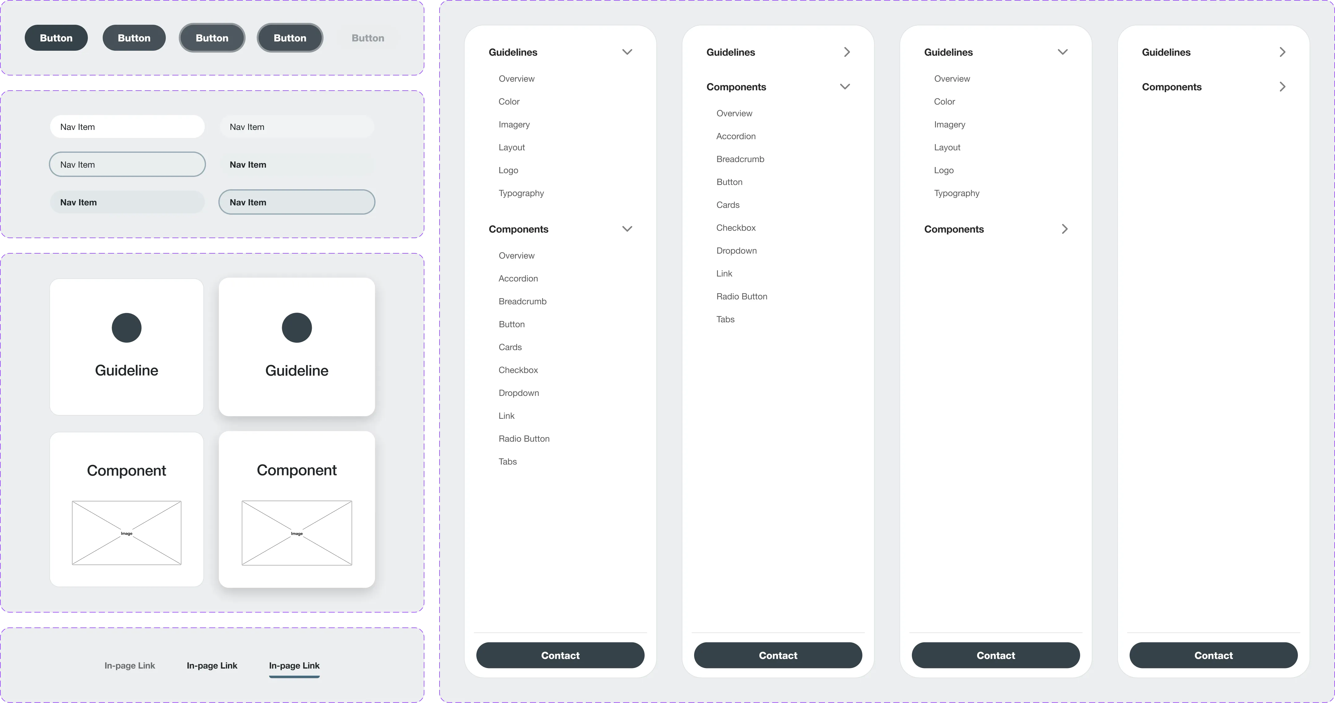
I drafted wireframes for initial feedback, then refined the designs focusing on critical areas like a persistent 'Contact' modal overlay, improved global navigation, and in-page navigation for pages rich in content.

Persistent Contact Modal (Low-Fidelity)
4.1
Persistent Contact Modal (Low-Fidelity)
Image
Global Navigation (Low-Fidelity)
4.2
Global Navigation (Low-Fidelity)
Image
In-Page Navigation (Low-Fidelity)
4.3
In-Page Navigation (Low-Fidelity)
Image

Content-Focused Visual Design

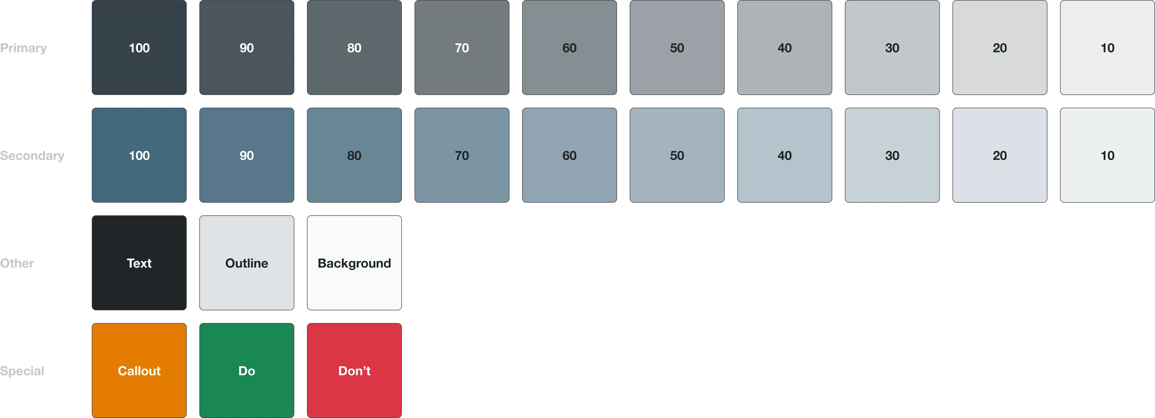
Along with utilizing Bootstrap as the framework, I opted for a subdued color palette and a minimalist design approach to prevent any visual distractions and to maintain a strong emphasis on the content itself.

Color styles Color styles
4.4
Color styles
Image
Components
4.5
Components
Image

Building & Coding

I used Bootstrap with custom CSS and JavaScript for specific features, ensuring adaptability and reliable functionality.
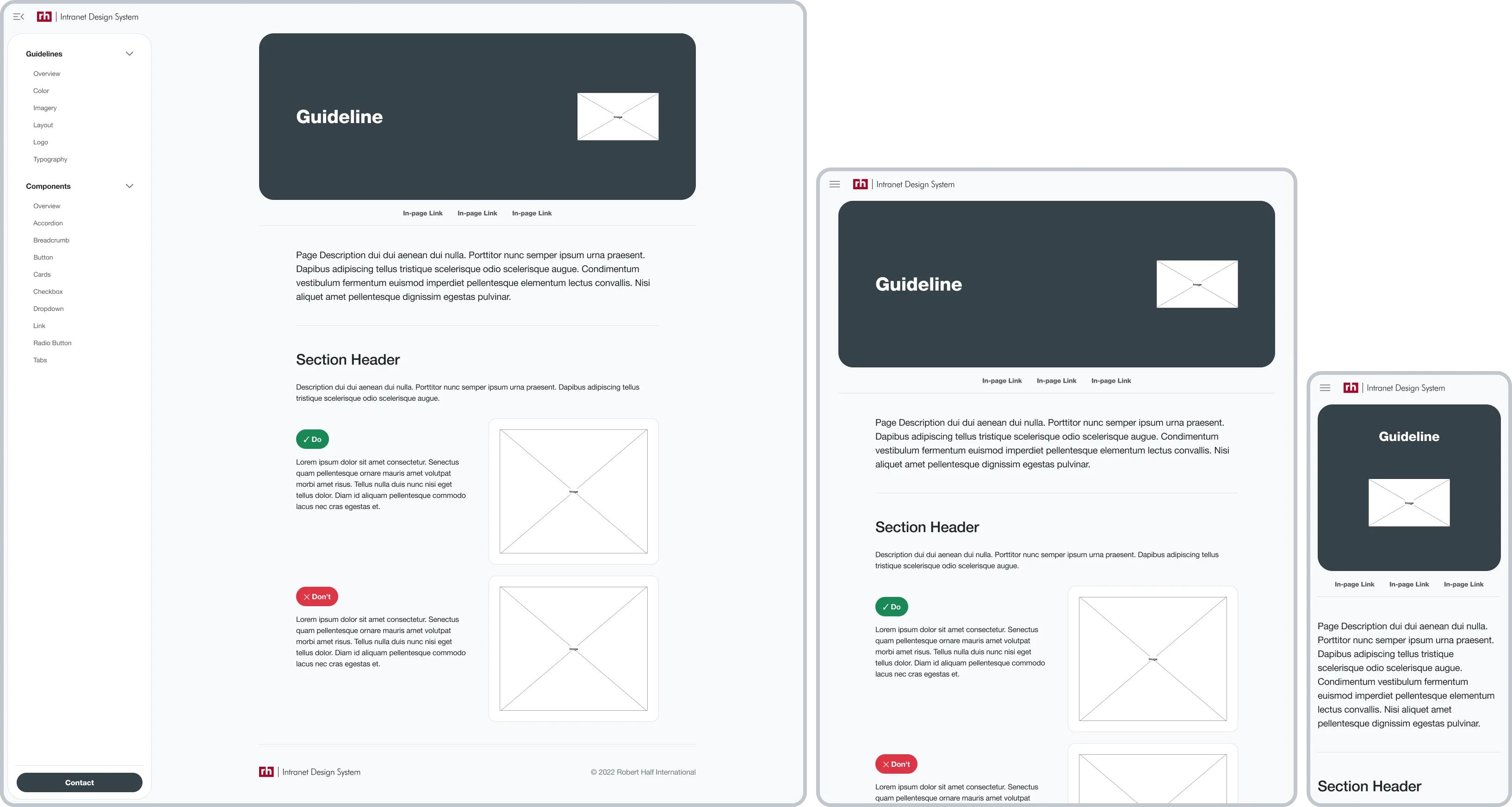
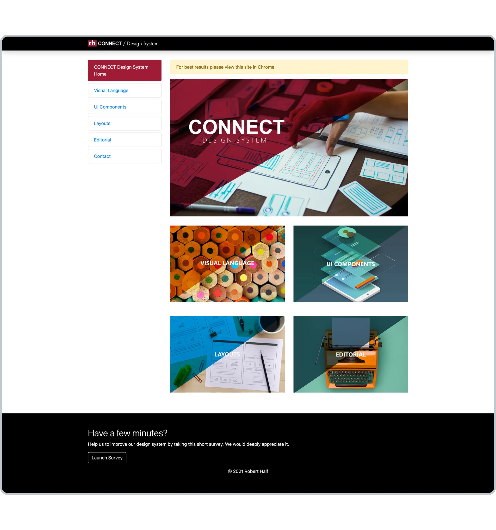
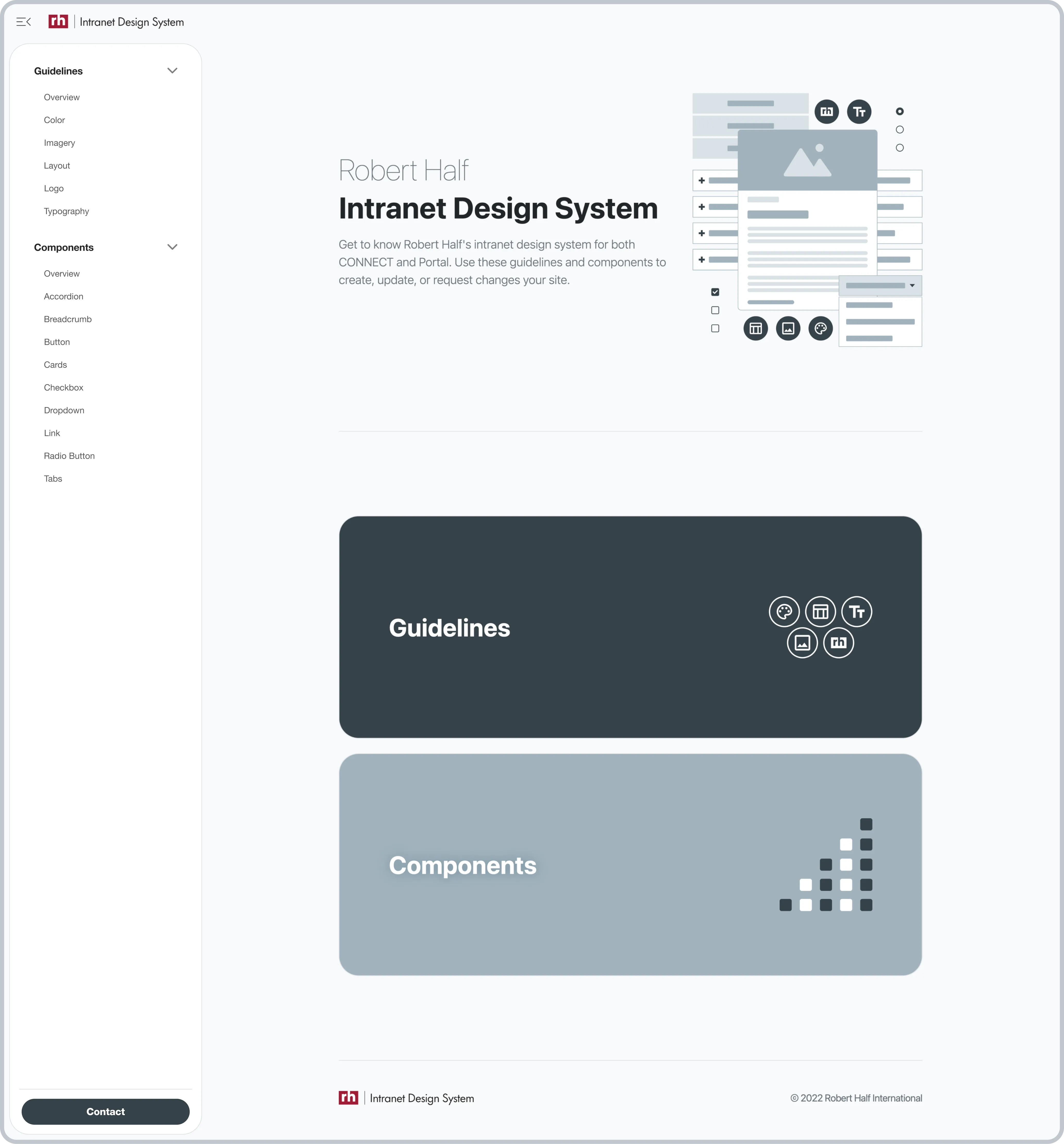
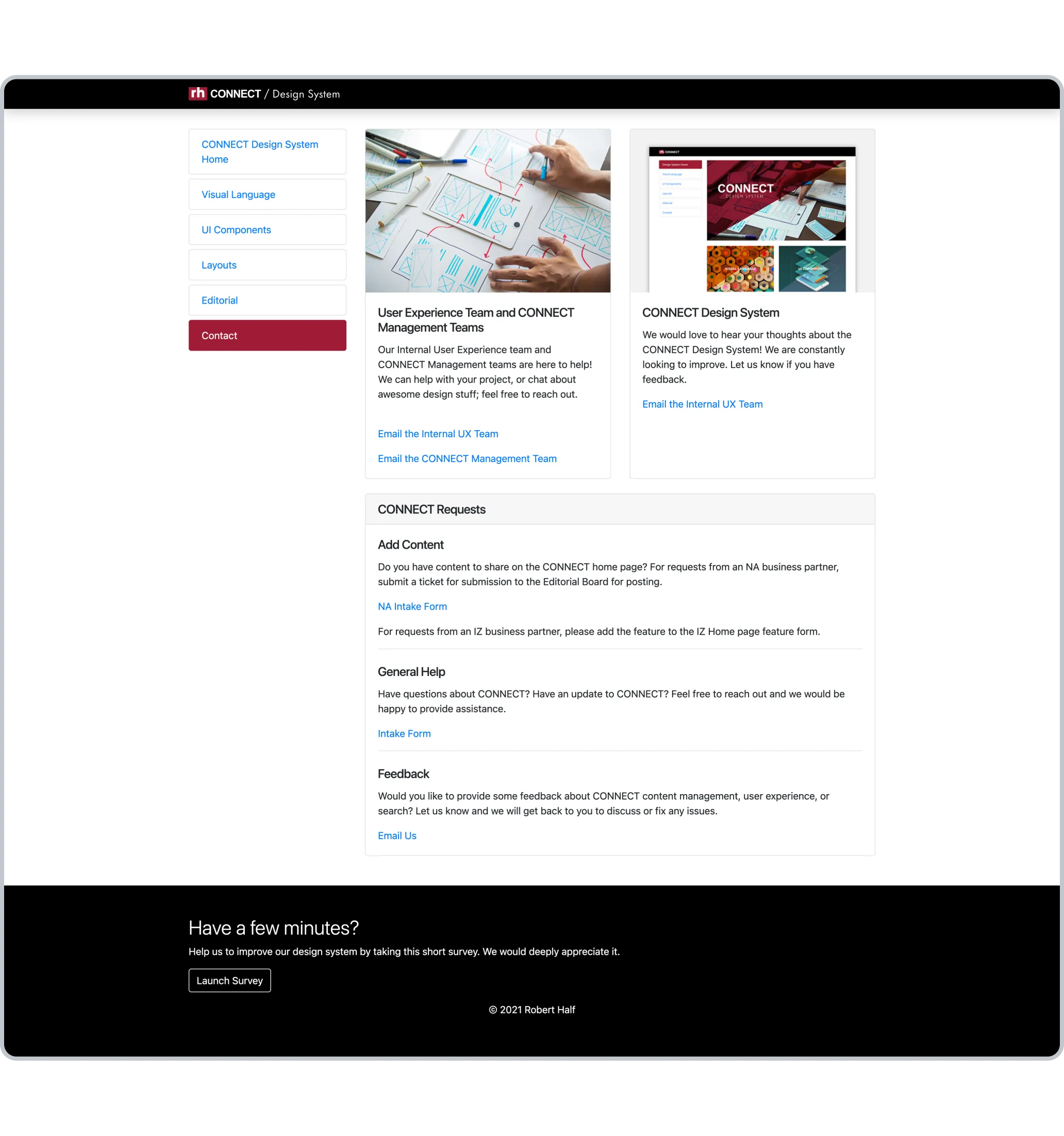
Responsive Layout Example
4.6
Responsive Layout Example
Image

Before & After

To provide a clearer visual journey of the changes implemented, here are some key frames to compare the intranet system before and after the redesign.

View Static Images
Before
Home Page (Before & After)
After
Home Page (Before & After)
sync_alt
4.7
Home Page (Before & After)
Interactive
Home Page (Before)
4.7.A
Home Page (Before)
Image
arrow_downward
arrow_right_alt
Home Page (After)
4.7.B
Home Page (After)
Image
View Static Images
Before
Contact (Before & After)
After
Contact (Before & After)
sync_alt
4.8
Contact (Before & After)
Interactive
Contact (Before)
4.8.A
Contact (Before)
Image
arrow_downward
arrow_right_alt
Contact (After)
4.8.B
Contact (After)
Image
View Static Images
Before
Section Overview (Before & After)
After
Section Overview (Before & After)
sync_alt
4.9
Section Overview (Before & After)
Interactive
Section Overview (Before)
4.9.A
Section Overview (Before)
Image
arrow_downward
arrow_right_alt
Section Overview (After)
4.9.B
Section Overview (After)
Image
View Static Images
Before
Content Page Example (Before & After)
After
Content Page Example (Before & After)
sync_alt
4.10
Content Page Example (Before & After)
Interactive
Content Page Example (Before)
4.10.A
Content Page Example (Before)
Image
arrow_downward
arrow_right_alt
Content Page Example (After)
4.10.B
Content Page Example (After)
Image
Outcome

Achieving Success Amid Constraints

Results

I was able to meet the deadline set by executive leadership, delivering a site poised for increased user engagement and guideline adoption.

By focusing on user pain points and leveraging iterative design, the newly revamped Robert Half Intranet is now more user-friendly, navigable, and aligned with executive objectives.

Challenges

flare
Legacy Constraints: Working with an outdated version of Bootstrap and Microsoft SharePoint required custom coding solutions.
flare
Lean Team: The small team size meant that clear goals, timelines, and effective communication were paramount for project success.

Takeaways

flare
Resourcefulness: Working with a lean team and under constraints demanded clear goal-setting and innovative problem-solving.
flare
Flexibility: Project limitations are not roadblocks, but challenges that inspire creative solutions.